
Waterloo Counseling Center
Project brief
I was invited to help rebrand Waterloo Counseling Center for their upcoming 30th Year Anniversary. Waterloo supports the mental health and well-being of all Central Texans by providing affordable individual, group, and family counseling with an expertise in gender, sexual, and cultural diversity. Their ultimate goal is to make people feel welcomed, accepted and empowered.
Solution
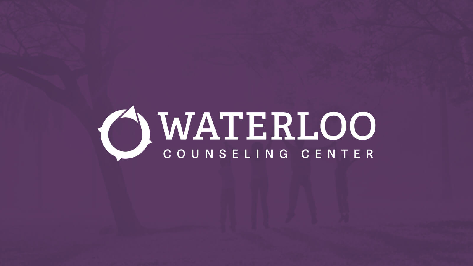
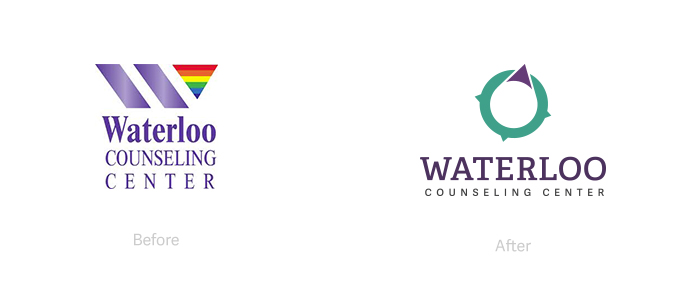
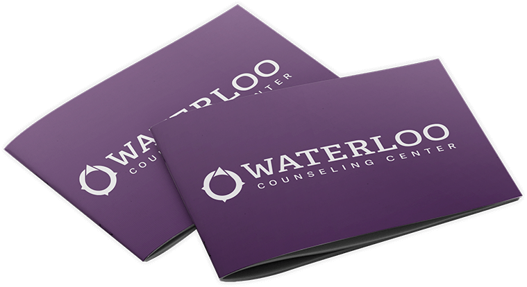
Our mission was to produce a fresh, modern brand identity for Waterloo. Requirements consisted of a new identity encompassing a recognizable triangle inside the "W". This represents guiding an individual on a journey, while the purple triangle speaks to Waterloo’s LGBT friendliness. A simplified color strategy was also implemented to appeal to all people regardless of nation, ethnicity, or sexual orientation. An added benefit included becoming more cost-effective by avoiding the high price of full color printing due to their current rainbow gradient scheme.
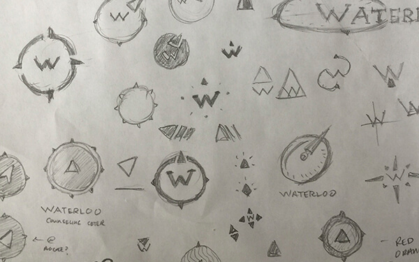
Logo Design
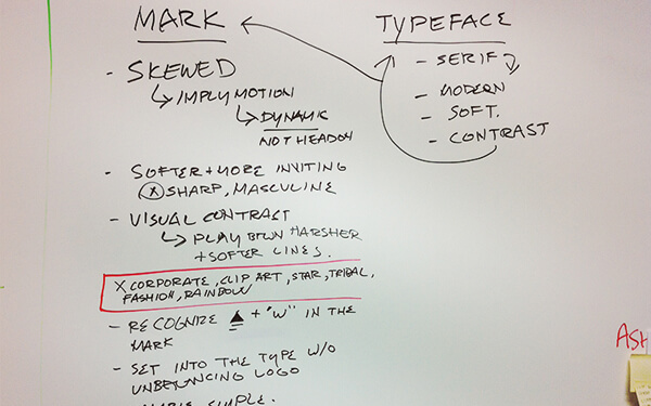
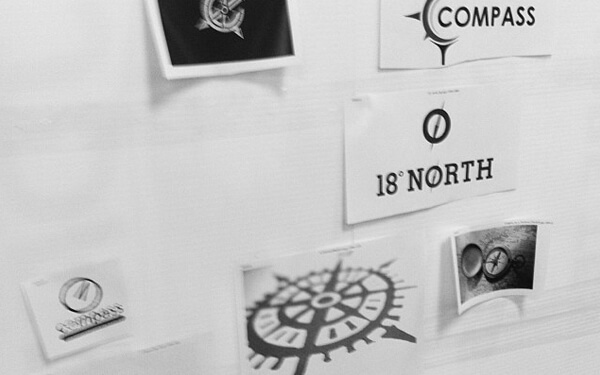
My focus was on initial design and conception for the logomark. We first started with word mapping and basic desired requirements. From there, we built mood boards sharing shapes, textures, patterns, and other ideas that I found with our team. Afterwards, I began sketching and drawing as many iterations as possible. Once we were happy with the direction, the illustrations were handed off to Julia who took over as lead visual designer and illustrator. The images were vectorized and outfitted the mark with typography and the branding was finalized.
Experience Design
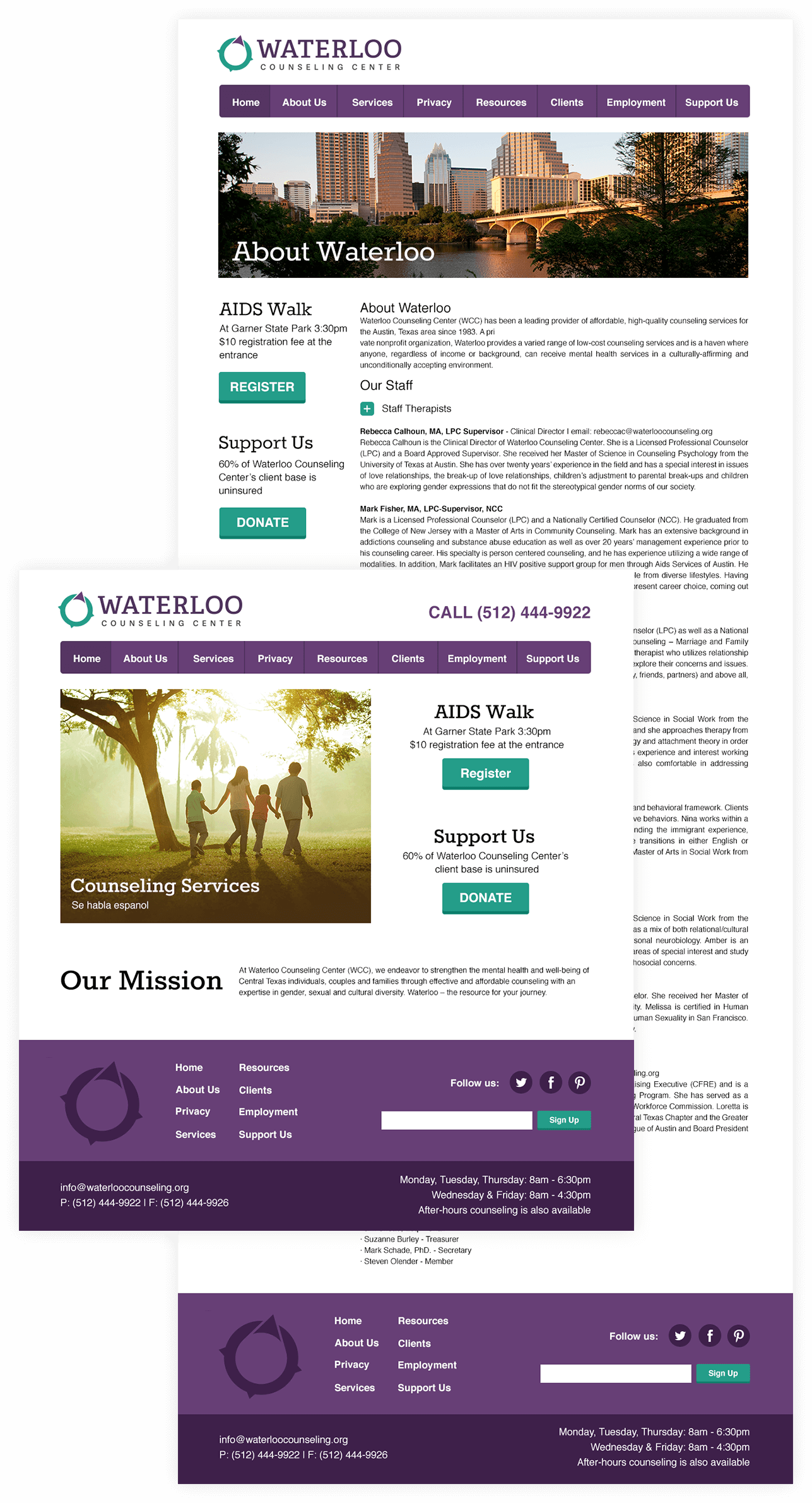
Our next goal was simple: to research Waterloo’s current website, and make improvements to encourage visitors to reach out, connect, and get help.
Some of those challenges included:
- Create unambiguous navigation to find pertinent information
- Make it easier to donate
- Encourage participation in upcoming events
- Improve visibility of contact information
I worked collectively with Danielle B. on the strategy and UX research. We set out to create a simple layout with a clear hierarchy that sat on a mobile first grid. This would allow us to create an accessible and encouraging online experience.
Strategy
Starting with a heuristic evaluation of Waterloo's existing website, we examined and rated its compliance with usability principles. From here, we performed a study of competitors’ websites and interface elements to identify key areas of improvements followed by a content audit. We scrutinized the entire website, constructing an outline of the information architecture to better define the hierarchy. This left us with an improved sitemap and overall structure which created a more effective, usable experience.
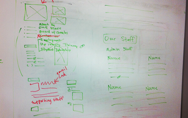
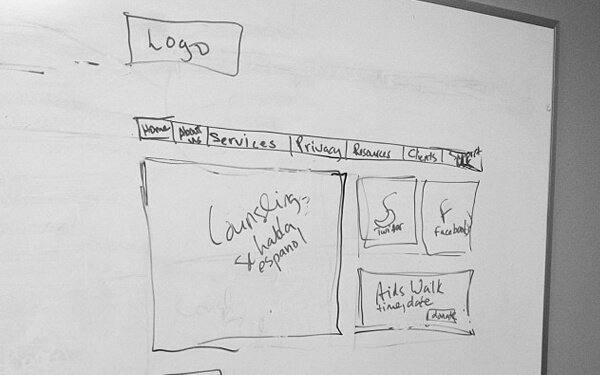
Wireframes
We brainstormed the site structure by beginning at the white board to explore the main layout and functionality. We moved into creating wireframes in Adobe Illustrator on top of bootstrap's responsive grid, as it is one of the most popular HTML, CSS, and JS frameworks for developing mobile first projects on the web.
By wire framing, we were allowed to focus on the content and user flows without being distracted by color schemes and font families.
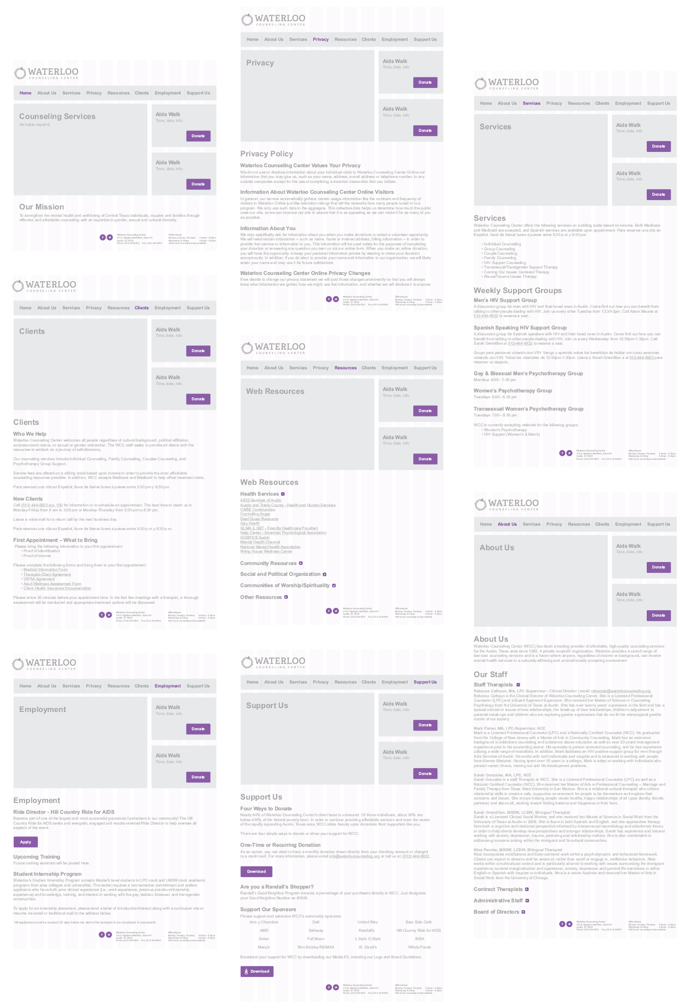
Visual Design
We handed completed wireframes off to the visual designers, where finalized mockups and UI Kits were packaged up and delivered to the engineer on the project. Because of my development background, I worked jointly with Brian to assist him and provide fully optimized images in .JPGs, .PNGs, and vector .SVG formats.
Results
The client loved the simple logo mark, stating it was a perfect representation of their message. Alternate versions support many layout options. An updated color strategy based on psychological influences will be used for future print collateral and web updates. Style guides provide them standards to keep their brand and typography consistent moving forward.
View a visual case study of Waterloo Counseling Center on Bēhance or watch a video compilation of the event.